Thursday, February 24, 2011
Tuesday, February 22, 2011
Data Selection
1. Downloaded the following:
qd24 – Quad index
cntbnd – County boundaries
cities_feb04 - Cities
publicland_sep10 – Public land
majrds_feb10 – Major roads
hy24p18 – Hydrologic pologons
hy24i18 – Hydrologic lines
gap_lcov18 – Land Cover
fnaiip_jun10 – Invasive plants
Flagler county
Quad #4411 (Bunnell)
2. Made sure in ArcCatalog all files were using Albers projection, and reprojected all files originally in another coordinate system.
3. Added cntbnd shapefile to map document in ArcMap.
4. Using Attribute table, selected Flagler county in cntbnd shapefile, and added layer from selection. Exported this layer to shapefile, and removed cntbnd.
5. One by one, added all other layers. After clipping them to just Flagler county, removed original layer.
6. Created three data frames.
7. Switched to layout view.
8. Arranged data frames, and added applicable layers to each frame.
9. Created legend, added title to map, added scale bar and text, added north arrow and prepared by/data source text.
10. Exported to JPG.
Thursday, February 17, 2011
Tuesday, February 15, 2011
Other GIS data sources
Out of curiosity, I looked up GIS data for my home state of New Mexico. I found the New Mexico Resource Geographic Information System (RGIS) clearinghouse. It is a repository of digital geospatial data from local and national public agencies, and is publically available. The data can be downloaded for free, except for a handful of large data sets which can be ordered on CD.
Projections Part 2
Process Summary (Practice assignment):
1. Went to Labins.org. Clicked on DOQQ.
2. Downloaded “5359” files from 2004 RGB Albers Units:MT Mr. SID and saved to H: drive.
3. Opened ArcMap, and added 5359 aerial data.
4. Closed ArcMap without saving and opened ArcCatalog.
5. Selected properties of 5359 file in ArcCatalog and changed spacial reference to provided ALBERS_FL.prj file.
6. Repeated this process for all four 5359 files, and reopened in ArcMap to see the files now had a useable scale.
7. Closed ArcMap.
8. Downloaded DRG (digital raster graphic) for Pace quad (mrg5358.exe) from Labins. (State Plane NAD83 Collars Removed).
9. Edited undefined spacial reference for this file in ArcCatalog to NAD 1983 StatePlane Florida North FPS 0903 (US Feet).prj.
10. Opened blank ArcMap document and added this file to verify useable scale.
11. Downloaded different data sources from FGDL (Florida Geographic Data Library) Metadata Explorer. (All Albers projections!)
“cntbnd” – County boundary
“USGS 24k Quarter Quad Index) – Quad index
“Major Roads”
12. Created excel file with 3 given locations of eagle’s nests in Santa Rosa County, FL.
13. Converted given latitude and longitude in degrees-minutes-seconds to decimal degrees using these formulas:
xcoor = degrees + (minutes/60) + (seconds/3600)
ycoor = (degrees + (minutes/60) + (seconds/3600))*(-1)
Y coordinates are negative because we are dealing with longitude west of the Prime Meridian.
14. Saved excel sheet and imported into ArcMap.
15. Right clicked on file in table of contents and clicked on “Display XY Data”.
16. Selected longitude as the x field, and latitude for y field.
17. Edited Geographic Coordinate system to “WGS 1984”.
18. Points are imported as an Event; exported data to make it a shapefile.
Process summary (Graded assignment):
1. Using the footprint layer (qd24.shp), picked two adjacent quads (5560 and 5660) in Escambria County, Florida. Downloaded these quads as 2004 RGB StatePlane FT Mr. SID aerials from Labins.org.
2. Defined aerials in ArcCatalog as: NAD 1983 StatePlane Florida North FIPS 0903 *US Feet).prj.
3. Reprojected Quad Index, County Boundary, and major roads shapefiles downloaded before to same State Plane.
4. Edited Escambria_tanks.xls file as with the practice exercise to have decimal degree values for x and y coordinates.
5. Imported this excel file into ArcMap like the practice excel file, and exported the event to make it a shapefile.
6. Reprojected shapefile in ArcCatalog to match State Plane projection, and used NAD1983 to WGS1984 option 5 geographic transformation.
7. Created map including this Tanks shapefile and DOQQ aerial images. Added essential map elements and exported to JPG.
8. Took screen shots of Data Frame Properties/Coordinate System tab to prove all required data sets and layers are in proper coordinate system.
Thursday, February 10, 2011
Wednesday, February 9, 2011
Data Classification
Q: Which classification do you think best represents the data and why?
I think the Natural Breaks classification fits the data best.
Equal Intervals doesn’t make sense because the distribution of African Americans should vary percentage-wise across the county. Some geographical areas will have a higher percentage of African Americas.
Quantile classification also fails to consider how the data (percentage of African Americans) is distributed. The enumeration units will not be of the same size for percent of population data, and although the map looks great, it is stretching and squeezing the data to give equal map area.
Standard deviation only works when the data is normally distributed. This data is not.
Natural Breaks classification works well to represent this data. Determining the breaks is fairly arbitrary (what really differentiates high percentage from medium-high percentage in practical, street-level terms?) but this classification is sensitive to distribution.
Tuesday, February 8, 2011
Queensland Flooding Task 3
Inspired by this article, I found this map, which is an experiment in crowd mapping. The goal was to combine verified reports of flood events and subsequent damage from government agencies and news outlets with user submitted reports of "incidents (things that “happen”) or situations which provide useful information to those affected by this disaster. This includes situations such as: Property Damage; Road and Bridge Closures; Evacuations; Injuries and Electricity Outages." (reference)
Reports could be submitted using email, text message, or twitter using hashtag #qldfloodsmap. There was also a free iPhone app.
The most obvious caveat to displaying this kind of data on a map however, is verifying user reports.
Reports could be submitted using email, text message, or twitter using hashtag #qldfloodsmap. There was also a free iPhone app.
The most obvious caveat to displaying this kind of data on a map however, is verifying user reports.
Projections Part 1
Process Summary:
- Opened cntbnd shapefile properties in ArcCatalog. Layer is projected in Albers type projection.
- Added layer to ArcMap.
- Added two data frames into document. Names: Albers, UTM, and State Plane N.
- Reprojected cntbnd shapefile to NAD 1983 UTM-16 coordinate system (NAD_1983_To_HARN_Florida geographic transformation), and dragged to UTM data frame in table of contents.
- Reprojected cntbnd shapefile to NAD 1983 HARN StatePlane Florida North FIPS 0903 Feet coordinate system, and dragged to State Plane N data frame in table of contents.
- Added “Area” field to attribute tables of all three data layers.
- Used Calculate Geometry option to calculate area of counties in all three layers.
- Created map showing each projected layer. Scale: 1:10,000,000.
- Generated table comparing areas for each projection for Alachua, Escambia, Miami-Dade, and Polk counties in excel, added to map.
- Added essential map elements, exported to JPG.
- Added UWF_N.jpg to Albers data frame. Photo appears as island in Atlantic. Edited spacial reference to NAD 1983 HARN StatePlane Florida North FIPS 0903 Feet. Image appears in correct spot.
- Reprojected raster image to UTM. Added to Albers data frame. Raster image appears in correct spot.
Tuesday, February 1, 2011
GIS Cartography
Process summary (Map 1):
1. Used ArcCatalog to look over the contents of the GISCartography data folder.
2. Used navigation tools to look closer at mex_elev layer.
3. Accessed properties dialogue for mex_elevation layer.
4. Accessed the properties for Mex_Roads layer.
5. Americas_Admin layers from ArcCataloge to ArcMap window.
6. Zoomed to Mex_boundary layer.
7. Used selection menu to select by attributes. In Layer dropbox of this menu, selected Americas_Admin. Under Method dropbox, left as Create New Selection. “CNTRY_NAME” = ‘Mexico’
8. Exported selected features to new shapefile and added as layer to map document.
9. Unchecked Americas_Admin layer in table of contents to hide it.
10. Applied labels to map. Picked symbol style “Country 2” and reduced font size to 12.
11. Changed symbol properties for World_Countries by picking new fill color and changing outline width to 2.
12. Changed symbology of Mex_States layer to a graduated color ramp by population quantity.
13. Switched to Layout view, changed to landscape orientation.
14. Added North arrow, scale bar and text, title and legend. Edited legend. Added labels showing names of individual Mexican states.
15. Exported to JPG.
Process summary (Map 2):
1. To Map 1, added layers: mex_rails, mex_rivers, mex_roads, and mex_urban. Unchecked Mex_states in table of contents.
2. Opened symbology properties for mex_rivers, and changed the layer to show based on Categories and Unique Values. Value field: RANK. Edited symbology of Primary and Major values. (Unchecked box next to “<all other values>”).
3. Displayed only Federal roads, changed symbology for mex_rails to predefined railroad symbol style, and changed symbol color for urban areas.
4. Edited labels properties for mex_urban layer to include all areas with more than a million people in the label class. Turned on only this new label class.
5. Changed to layout view, changed scale to 1:5000000.
6. Switched back to data view, converted labels to annotations. Changed size of symbol.
7. Created inset map to indicate where this map is zoomed to.
8. Rearranged and fiddled with map elements.
9. Exported as JPG.
Process summary (Map 3):
1. Using Map 2, removed every layer but World_countries from Layers data frame.
2. Added mex_elev raster layer.
3. Experimented with classified and stretched symbologies for raster layer.
4. Selected stretched symbology with Blueà Yellow color ramp.
5. Rearranged map elements.
6. Exported as JPG.
Tuesday, January 25, 2011
Overview of ArcGIS
PROCESS SUMMARY
1. Opened World_Countries shapefile
2. Saved .mxd file under my initials
3. Opened attribute table, sorted ascending by country name.
4. Selected Dominican Republic, closed attribute table.
5. Zoomed out, deselected Dominican Republic, and selected island features by rectangle.
6. Opened attribute table, clicked on button to show selected features.
7. Cleared selected features.
8. Used Identify tool to click on Venezuela.
9. Used Find tool to find country of Andorra.
10. Used Find tool to find the country with the ISO_NUM of 833.
11. Used the Go to XY tool to zoom to 89 degrees West Longitude and 14 degrees North Latitude (El Salvador).
12. Selected the Measure tool and measured countries east to west length.
13. Zoomed to full extent, and added point layer Cities to ArcMap.
14. Changed the symbol for Cities to a black square, size 2.
15. Changed symbology controls for World_Countries. Fields: POP2007, number of classes: 7, and changed color ramp.
16. Changed background of map to blue.
17. Switched to layout view.
18. Changed page to landscape view to better fit data.
19. Inserted neat line, north arrow, legend, scale bar and scale text.
20. Changed labels on Legend.
21. Inserted my name and data source.
22. Exported map as JPG.
Thursday, January 20, 2011
Bad map vs. Good map
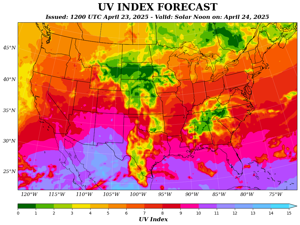
BAD MAP!
Map generated July 4, 2009.
http://www.cpc.ncep.noaa.gov/products/stratosphere/uv_index/gif_files/uvi_usa_f1_wmo.gif will give you a map for today.
The UV index is an international standard measurement of the strength of ultraviolet (UV) radiation from the sun, used as a forecasting tool for the public to help protect against UV overexposure. The index is an open-ended linear scale, with an index of 10 corresponding to midday sun on a clear-sky day. Higher index values represent a higher risk of skin damage from UV exposure.
GOOD MAP!
Aside from the typo (Ethiopia), I like this map. The proportional symbols for major ports and trade routes are simple (even if Singapore is a little distracting) and give just the right amount of geographical information. The expanding range of pirate attacks shown in gradational bands by year captures the chronology of data.
Tuesday, January 18, 2011
Getting Started with ArcGIS
Deliverable 1
Opened file tourism.mxd
Followed tutorial instructions for activating different data frames
Activated San Diego data frame, and zoomed in. Manually changed scale to 1:50000
Panned across map and centered
Activated bookmark on San Diego City to reset the map, and changed to data view from layout view.
Selected hotels on table of contents to make hotels display on map
Activated label features on hotels
Selected find tool and searched for Marriott
Used flash feature to find Marriott Suites hotel
Used Identify tool to select Marriott Hotel and Marina and to view phone number in Indentify window
Checked Major Attractions in table of contents, and viewed attributes table for Major attractions
Identified and selected Seaport Village
Selected measure tool, set distance to miles
Measured from Marriott Hotel and Marina to Seaport Village
Measured from Marriott Hotel and Marina to closest trolley stop on map
Cleared selected features
Used bookmark feature to reset map view
Unchecked major roads in the table of contents
Selected major attractions in the table of contents and selected feature label
Used identify tool on trolley stops near Qualcomm Stadium
Zoomed in on San Diego Zoo, unchecked surface streets in table of contents
Selected hyperlink for the zoo and examined the website in a new window
Saved map to H: drive
Selected layout view
Added name and date
Added data source
Exported map as jpg.
Deliverable 2
Opened youthcenter.mxd
Opened attribute table for Census Block 2000 and Youth Population layer
Viewed demographic information for AGE_5_17
Closed attribute table
Deactivated Youth Population and activated City Zones
Selected City Zones and zoomed to layer
Opened City Zones attribute table
Located LU_ABV data field
Closed table window
Selected Geoprocessing and chose Union
Added input feature City Zones
Added input feature Census Blocks 2000
Selected LearnArcGIS10\Start\YouthCenter.gdb for output feature class, and save as zones_Union
Selected zones_Union and zoomed to layer
Selected zones_Union and opened attribute table, making sure both LU_ABV and AGE_5_17 were in table
Selected selection menu and selected attributes
“create new selection in method” field
“LU_ABV”=’RES’, apply
Select zones_Union and zoomed to features
Selected select by attributes and chose select from current selection
Deleted previous expression from box
“AGE_5_17”>=75, apply
Selected full extent tool
Moved available building layer to top of list
Checked Available Buildings in table of contents
Opened selection menu and picked select by location
Selected select features from, available buildings, completely within selected features and zones_Union layer
A result of 6 building appeared on the map
Unchecked zones_Union layer
Added title
Added neatline
Adjusted zoom
Added legend, north arrow, and scale
Added name and date
Added data source
Exported map as .JPG
Subscribe to:
Posts (Atom)